Wednesday, September 30, 2015

Unusual And Interesting Photos (paintings and photography)


1. Below each photo are suggestions for photographers. List 3 of the ones you think are the most important for photographers to remember when they are out shooting. 
  • Having a connection with your subject
  • Look out for repeated patterns in photography and get good photos of them.
  • Photographers shouldn't get hung up with finding spectacular subjects for their photos. A better skill to have is making the ordinary seem extraordinary.
2. Pick your favorite painting, get a copy of it and post it on your blog.

3. Then go find a REAL photo that looks like your painting. DO NOT GET AN ACTUAL PHOTO OF THAT PAINTING, find a photo that copies the style of the painting, but is NOT the painting.

4. Did the photographer follow the suggestions fully?

I feel the photo follows most of the steps mentioned. The painting is muted and casts shadows like the photograph. Also, the gas station is an extraordinary subject.

5. Which style of painting do you think might influence you?

The portrait style paintings and the landscape oil paintings were the most influential. In the portraits, the artists captured emotion from the people's expressions. This really helped tell a story. I want to do the same as a photographer. The oil landscapes were colorful and casted dramatic shadows, I hope to capture photographs with the same elements.

Unusual And Interesting Photos

1. What is your reaction to his work?

I think Christian Ruhm's work is interesting. His twist, making the famous landmarks projected over each other, is very intriguing. The colors in his photographs are muted making his selection have an old-timy effect. 

2. How do you think he made these photos?

I think Ruhm made his photos with overlays of multiple exposure. One might achieve this effect by using photoshop. 

3. Think about some buildings you have seen, which ones would be good to take a photo like this? Tell me about those buildings, where are they, could you get easy access to them? 

Christian Ruhm photographed landmarks like the Eiffel tower and the Big Ben, which are located in Europe. The other buildings also probably have an important historical background. I feel the Eiffel tower was a good place for him to take a photo and edit it the way he did because of all the intersecting lines the tower has. Makes an interesting photo. I don't think I would have easy access to the landmarks in Ruhm's photographs because they are far away and travel is expensive.

Friday, September 25, 2015

Black And White Photographers PART 2

        Lee Friedlander was born on July 14, 1934. He studied photography at the Art Center College of Design in Pasadena, California. In 1956, Friedlander moved to New York City, where he photographed jazz musicians for record covers. His was work was influenced by Robert Frank, Eugene Atget, and Walker Evans. The Guggenheim memorial foundation awarded Friedlander in 1960. Some of his most famous photos are nude photographs of Madonna from the late 70's. Lee Friedlander's style focused on "social landscape." He captured photos that captured the look of modern life. Friedlander had his first solo museum show in 1963. He was then a key figure in curator John Szarkowski's 1967 "New Documents" exhibition at the Museum of Modern Art in New York. Later in 1990, the MacArthur Foundation awarded him a MacArthur fellowship.  While Lee Friedlander suffered from arthritis and housebound, he focused on photographing his surroundings. He wrote a book called Stems, which reflected over his time he had knee replacement surgery. Lee Friedlander is a very accomplished photographer with his art receiving numerous acclaimed awards.


The little Screens
1963

New York City
1962


sources:

"Lee Friedlander." Lee Friedlander. N.p., n.d. Web. 25 Sept. 2015
"Lee Friedlander." Joseph Bellows Gallery. N.p., n.d. Web. 25 Sept. 2015.


Thursday, September 24, 2015

Academic Shoot Preview

1.  Why did you pick this photo? 
The photo I picked is by Casey Simmons and called: "Junior year". I chose this photo because of the story it tells and the different angle the photographer captured. The photo shows a boy, sitting on the floor of what I assume is the school library, with a lot of books before him, probably studying. I like how the picture is black and white and has a somewhat fish eye effect. Another thing I liked about this photo is the angle from above which allows a person viewing this photo to see all around the subject.

2. What rules of photography are evident in the photo?
 The bookshelves around the subject make this photo balanced because of the shelves on the edges of the picture surrounding the subject. Another rule of composition in this photo is Framing. Again the two bookshelves seem to frame the subject from the sides.

3.Where do you think you could take photos like the ones you look at today? A lot of the photos I looked at today were taken in a science class. I think I would also take photos in the science room but only if their was a science experiment like the photos showed. Another place I'm thinking of taking photos is my spanish class. I think this would be a good place to capture action and emotion because in my spanish class the students are very active and we are always learning new things. Their are no desks in the class, and we learn in an unconventional ways. 

4. Whose classroom would you like to visit and take photos in? As I answered in question three, I would like to take photos in my spanish class. The classroom is very colorful and I think I could capture some interesting photos.

5. What will you do, as the photographer, to get amazing photos like you look at today? As the photographer, I will try to get photos that have the rules of photography evident in them. The photos I looked at today captured stories and were shot from abstract angles. Next week, when I go out to take photos I will try to get photos that show emotion and have stories, and I will try to capture images from unique angles.

Filling The Frame

By: Dylan Gray

This picture fills the frame with lab students framing and surrounding a purple haze. I think this photo is very interesting because of the beautiful purple light and the students with masks around it. You can even see that the student on the left is poling at the light. 

Action And Emotion

By: Casey Simmons

This photo shows plenty of action and emotion. The emotion is from the two girls doing a science experiment, with the girl in the red shirt preforming the experiment, expressing wonder and excitement as the chemical reaction occurs. Her lab partner stands by watching also entertained and excited. The bubbles and foam in the experiment fill the the image and show action and a person viewing this photo could see the movement captured in the image.

The Story

By: Samantha Jung

I think this photo by Samantha Jung tells the best story from the selection. The story appears to be the students giving food to homeless people. That is also the title of the photograph, but I feel this image says a lot.Visually, you can see students passing burgers to people in line. Judging by the peoples' clothing, it must be either fall or winter. The students are helping out to people in need. The photographer captures action and emotion in this image.

Tuesday, September 22, 2015

Photo Manipulation And Ethics

A.  In the article Ethics In The Age Of Digital Manipulation  by Mark Hancock, the article talks about journalists manipulating their photos. Many of the journalists lost there jobs for the digital manipulation. Some examples include the photographers editing objects or effects in to make the photo more interesting to the viewers.

B.  I think this kind of photo editing is unacceptable and unethical because of the misleading story the slight change can project. If the journalist is capturing an important event news worthy, they should accurately portray the event.


From the two sites we were given to search manipulations, I found this photo by Brian Walski to be the most unethical. The photographer was capturing an important event and makes drastic changes. I feel the editing done looks very realistic and the differences made could change a viewers outlook on the image. Another unethical manipulation I found, was a newspaper that edited  George Bush and Saddam Hussein to appear debating with the title also suggesting that the two had a debate, but in fact they never did.


I chose this manipulated photo by John Flio for the least unethical because of how unnoticeable and unimportant the slight change is. The slight change in the image is the removal of the pole behind Mary Anne Vecchio. The event the photographer is capturing is important, and his manipulation to the photograph does not change the event the original picture shows or its importance. Though the changes he made are small and do not distract from the original subject, I still think the journalist should not have done what he did.

Friday, September 18, 2015

Post Shoot Reflection


1. What challenges did you encounter while trying to get the photos of your first 4 prompts (Square, Metal, Happy, Bowie)


A challenge I encountered was managing the focus. The auto focus would not always focus on my subject so I'd do id'd do it manually. Another challenge I faced was taking prompts and rules of composition photos. It's difficult to look out for all the certain aspects and get them into the photos.


2. What technical aspects of photography or the assignment in general (focus, framing, holding the camera, etc.) did you find yourself thinking about the most? Provide a specific example of what you did to do this correctly.


I found myself thinking about the focus and framing the most. Like I said on the previous question, the auto focus was not really working for me. Also I tried to focus on the framing.  When framing I tried to find distinct things framing the subject like shadows, tree branches, building arches, and etc.


3. If you could do the assignment again, what would you do differently now that you know some basic rules of photography?


I think what I would do differently is take less and more specific photos that fit each prompt and rules of photography. Because I took more random photos that were unnecessary.


4. What things would you do the same? 


Something I would do again would be taking photos at different angles. By trying new angles, i got more interesting images.


5. Finally - go back and edit your blogs with the 4 photos (square, metal, happy, Bowie), tell me what rules of composition (which you just learned about) did you end up actually achieving? Did you have any?


I achieved capturing some of the rules of composition, though I wished i could have included them in a more obvious way.


6. Are you interested in shooting those same prompts again, why?

I would be interested to shoot the same prompts again. Because I think it would be neat to see if i could capture the prompts in a different way.


http://jadonsphotojblog.blogspot.com

Wednesday, September 16, 2015

Prompt Shoot


Happy
I think this photo shows simplicity because it is simply the subject with a brick wall as the background. Also the shadow in the image casts a line across the photo, making the picture have lines too. ( plus the walls pattern shows lines) The shadow in a way, also acts as a frame. Framing the subject in the shadow.

Metal
This photo shows examples of lines and rule of thirds. The lines featured are the bars and the shadows they cast across the subject. I can see many geometric shapes in this picture. For rule of thirds, my subject, Olivia's shoes are positioned in a corner of the thirds. 
Bowie
Looking back on this photo now, I realize that the car positioned in front of the corner of my subject  is a distracting merger in the photo. Also I could have found ways to photograph the truck with more elements of composition, and that my focus could improve. But I do think the open foreground and background offer a feeling of balance. 
Square
This image shows elements of balance, framing, and lines. I think this photo shows balance because of the geometric shapes and the subject has lots of foreground. The columns surrounding the kids eating lunch frame them and give a sense of dimension. For lines, the columns could double as lines as they end at a faraway point in the background in a dynamic way. My focus could definitely improve.
Merger
I chose this photo as a merger because when viewing the photo I wasn't sure what my subject was and there are distracting elements placed in the foreground. The photo does offer lines from the lighting casting some shadows and all the wires.


Thursday, September 10, 2015

Avoiding Mergers

By Russell Boyce
I chose this photo for avoiding mergers because there are some mergers in the image. One of the main mergers is the american bow on the pole. The affect of this merger is that the person viewing the photo could be distracted by the pole with the bow and not focus on the subject; the man. Besides the merger, i found this picture to be really impactful and great.

Simplicity

By Richard Drew
I chose this photo for simplicity because there are no mergers in the image accept for the lines projected from the building. And you can clearly tell what the subject of the photo is. This photo is horrifyingly simple in a way, with the man falling. In the image there are also geometric shapes and lines giving depth to the photo.

Balance

Dan Loh
I chose this picture for balance because of how balanced the image is. The subject, the statue of liberty, has buildings on either side making it balanced. In the image, the light leaves some diagonal lines and casts shadows, giving the photo more depth. Also this picture has manny geometric shapes.

The Rule Of Thirds

By Mario Tama
I chose this photograph for rule of thirds because the subject is clearly in within one of the thirds. There is space before the subject.

Framing

By Steve Mcurry 
I chose this photo for framing because the subject, the fireman on the latter, is framed by the edges of shard debris. The image has lots of geometric shapes giving it a more dynamic feel. The shards of the debris are shadowed and letting in the light and color of the other debris and the fireman.

Lines

This photo demonstrates lines because the wreckage creates manny geometric shapes and lines. The lines in the photograph make it so impactful.

Tuesday, September 8, 2015

The Camera: History and Information


1. Explain the “camera obscura” effect. How is it achieved? 

The camera obscura effect is like the first camera. The effect is achieved with a hole on the wall of a dark chamber. The hole acts like a lens projecting light onto the opposite wall. 

2. What invention during the 17th Century helped man get a step closer to creating the modern camera?

 The invention of glass lenses by Issac Newton and Christian Huygens helped the two have a better understanding of optics and led man one step closer to the invention of the camera.

3. What were the parts of the first modern camera invented by Niepce?

 Niepce invented film and the modern camera was born.

4.What do modern digital cameras have in common with Niepce’s camera? 

Both the modern digital camera and Niepce's version function similarly. Light passes through the lens, into the camera, and exposes the film in both cameras.

5. What do digital cameras use to capture an image?

 Digital cameras capture images with an electric sensor called CCD. Photographs are stored on computer memory devices.

6. What is the difference between the Auto Mode and the Program mode?

 On auto mode the camera will control flash and exposure, with auto mode the photographer is guaranteed a good photo with just having to point and shoot. Program mode allows the photographer to control and choose the settings of the camera (like the flash and etc.).

7. What is the Portrait mode used for? How does it work? 

Portrait mode is used for portraits of people. The camera will attempt to blur the background and use the lens setting aperture.

8. What is the Sports mode used for? (not just sports) How does it work? 

Sports mode is used to record/photograph moments with movement and action. To freeze the motion the camera will use the highest shutter speed possible.

9. Why should you do a half press on the trigger button? 

Using a half press on the trigger button will let the photographer have a faster camera result time, more control over focus, and better composition.

10. What does this symbol mean? When would you use this? 

This symbol means no flash. You would not use flash if you want a more dramatic tone by using natural lighting.

11.What does this symbol mean? When would you use this? 

This symbol means auto flash which the camera would automatically use flash. You would use auto flash if the camera thinks it needs more light.

12. What happens to your photo if there is too much light? 

If there is to much light in your photo it might look washed out.

13. What happens to your photo if there is not enough light?

 Not enough light will make the picture appear to dark.

14. What is a “stop.”

 In photography a 'stop' is used to represent a relative change in the brightness of light.

15. How many stops brighter is the new planet if there are two suns instead of one? 

The new planet would be one stop brighter.

16. How many stops brighter is the new planet if there are four suns instead of two? 

The planet would be two stops brighter.

17. What affect does a longer shutter speed of have? 

The effect of a longer shutter speed is more light.

18. What affect does a shorter shutter speed have? 

The affect of a shorter shutter speed is less light.

19. What does the aperture control?

 The light reaching the film.

20. When adjusting the aperture, how can you increase the amount of light?

 You can increase the light by changing it to a larger F-stop,or a larger opening.

Thursday, September 3, 2015

Great Black And White Photographers

Lee Friedlander
New York
1963  
John Gutmann
The Artist Lives Dangerously
San Francisco, 1938
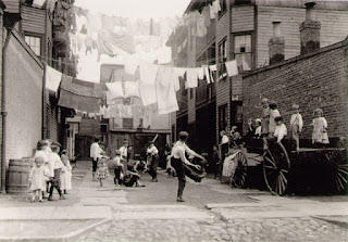
Lewis Hine
Playground In Mill Village
1909

Tuesday, September 1, 2015

First Day Photos

Something Living

A Picture Of My Partner Lail
This is a candid picture of Lail talking about Bowie. I like this photo because being a freshman,  I had questions on where everything was and what the school is like and he answered them. This picture also shows the entrance to Bowie from the bus entrance. I come through this way on my way from the bus in the mornings. 

Free Choice
I chose this picture of a cicada shell as my free choice. When I first saw this photo I thought it was kind of gross, but looking at it for awhile I saw its merit. I think this photo is interesting because you can see the bug in detail. Personally, if i see a bug i will not study it in depth, so I think this photo's cool because it lets me see a cicada magnified and changes my idea on what the bug looks like.

First Day Of School
This picture reminds me of the first day of school because I ate lunch by the sign and the tree.